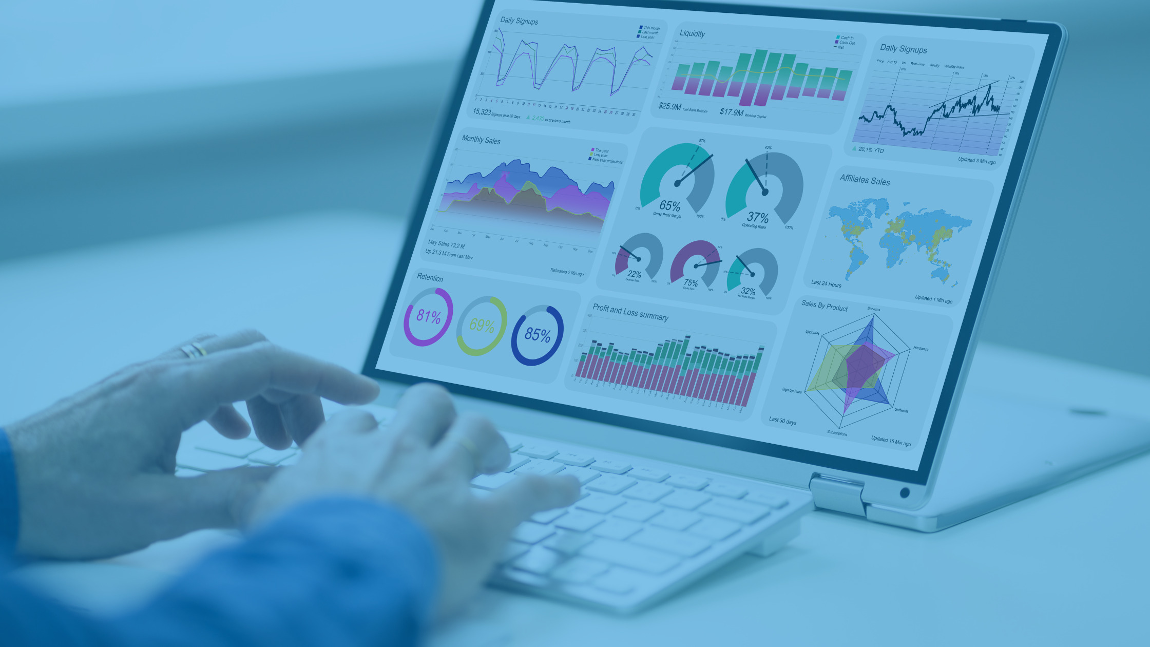
Data visualization is all about story telling, if the data is out of context the story might be unnoticed.
So how do we choose the right graph or chart for our dashboard?
Data visualization is all about story telling, if the data is out of context the story might be unnoticed.
So how do we choose the right graph or chart for our dashboard?
Documenting application feature details is quite often not given the attention needed as part of the development lifecycle and may be an after thought to the project deliverable artifacts. This, also, holds true for the development of Power BI Services (Workspaces, reports, dashboards, datasets, dataflows, etc.)…
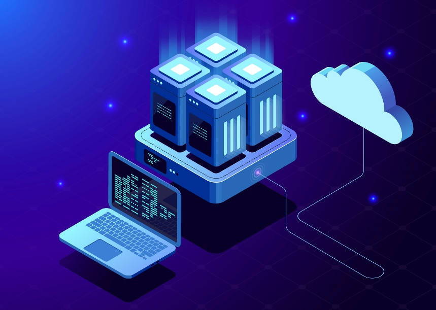
Using Microsoft Power BI in data engineering We have a lot of discussions with clients about a desire to do “better reporting”. They have been using Power BI but feel they now need a data warehouse to create reports that will give them all the info they need. Fundamentally, organizations often have an analytics problem, one for which a data warehouse forms part of the solution, however, the complexities lie in the data. Often organizations…


The way in which we use and interact with data has dramatically changed over the years. Originally, we leveraged static pictures and charts that captured a one-time snapshot of our data. But this is no long sufficient, as static visualizations only provide a historical view at a single point in time. Instead, interactive visualizations and real-time reports are now the demanded norm needed to turn massive volumes of data into immediate, actionable insights. But there…

Ready to create modern reports using SharePoint as a data source? If so, then once again, you’ve come to the right place. For those familiar with SharePoint, you know that SharePoint offers many different data store types, including SharePoint lists, SharePoint libraries, and documents (such as Excel files stored in SharePoint that contain data within them). And where there is data, there is a need to report on it in order for you to uncover…
©1997–2024 Imaginet. All rights reserved. Privacy Policy | Cookie Settings